The Symmetry
Engine
Redesign
As you interact with this interface, you feel a sense of ease, like slipping into a comfortable pair of shoes. The transitions are fluid like MJ's dance moves, and the feedback is clear giving you a warm feeling.
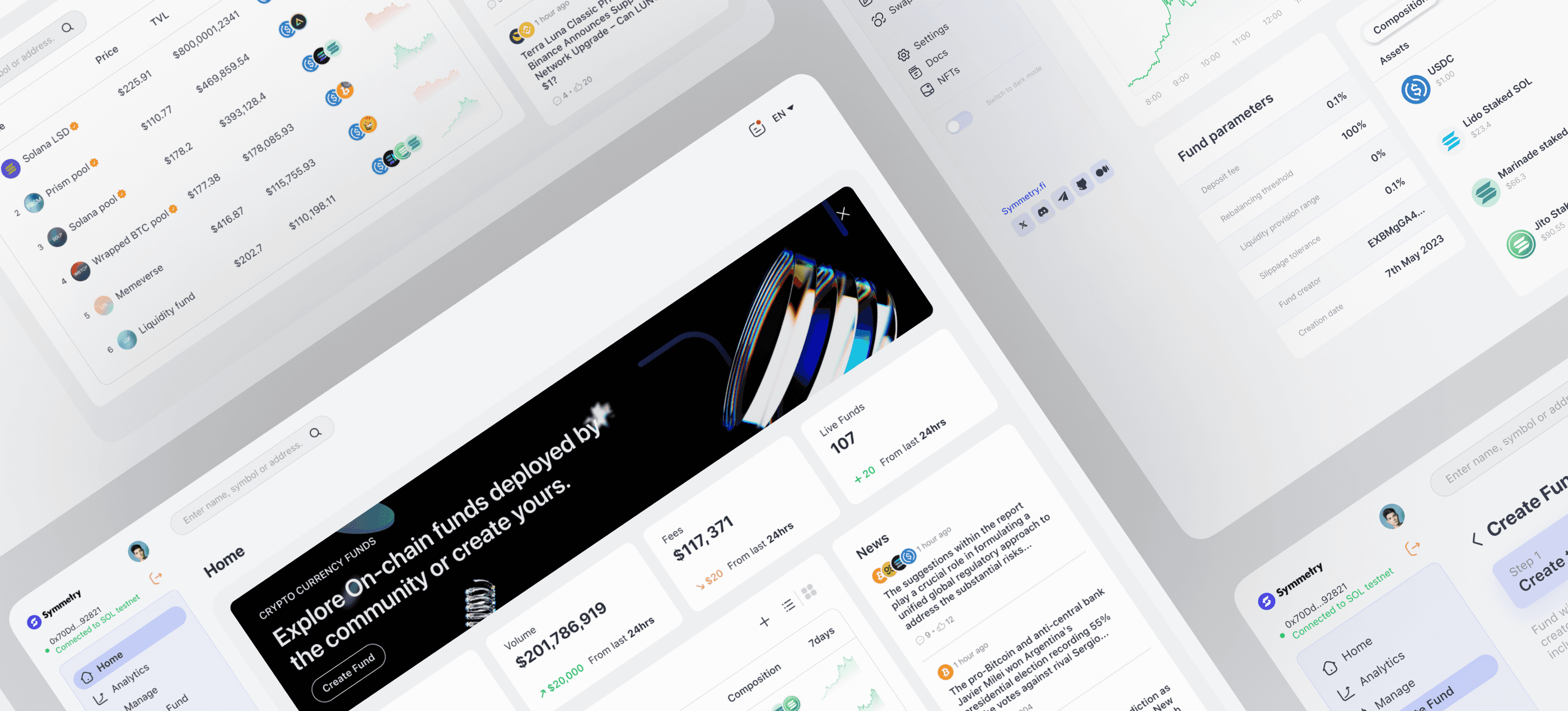
Our design explores a warm concept that enable smooth and effective fund management for all users on the blockchain.
Light/ Dark mode
To improve your vision, easily switch between light and dark modes. The one-click button is accessible from anywhere on the app.
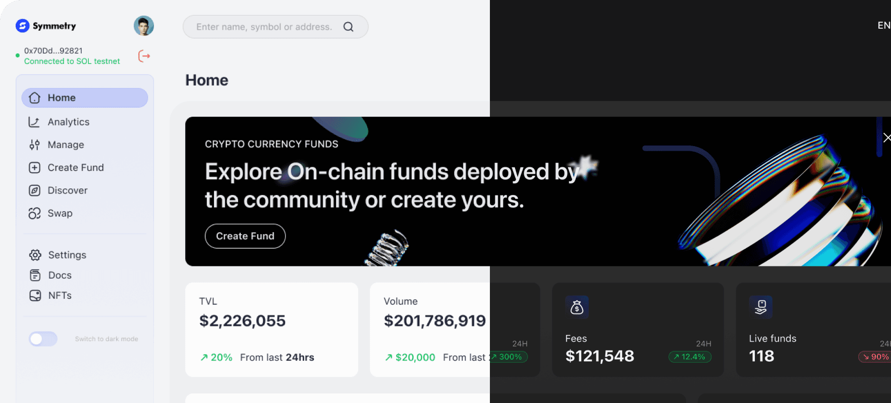
What motivated us to do this?
The vast complexity of Symmetry Engine can turn off the minds of users, who perceive it as being a little too technical. Thus, we created a warm, comfortable design that will allow them to sail over the turbulent Symmetry ecosystem with ease.
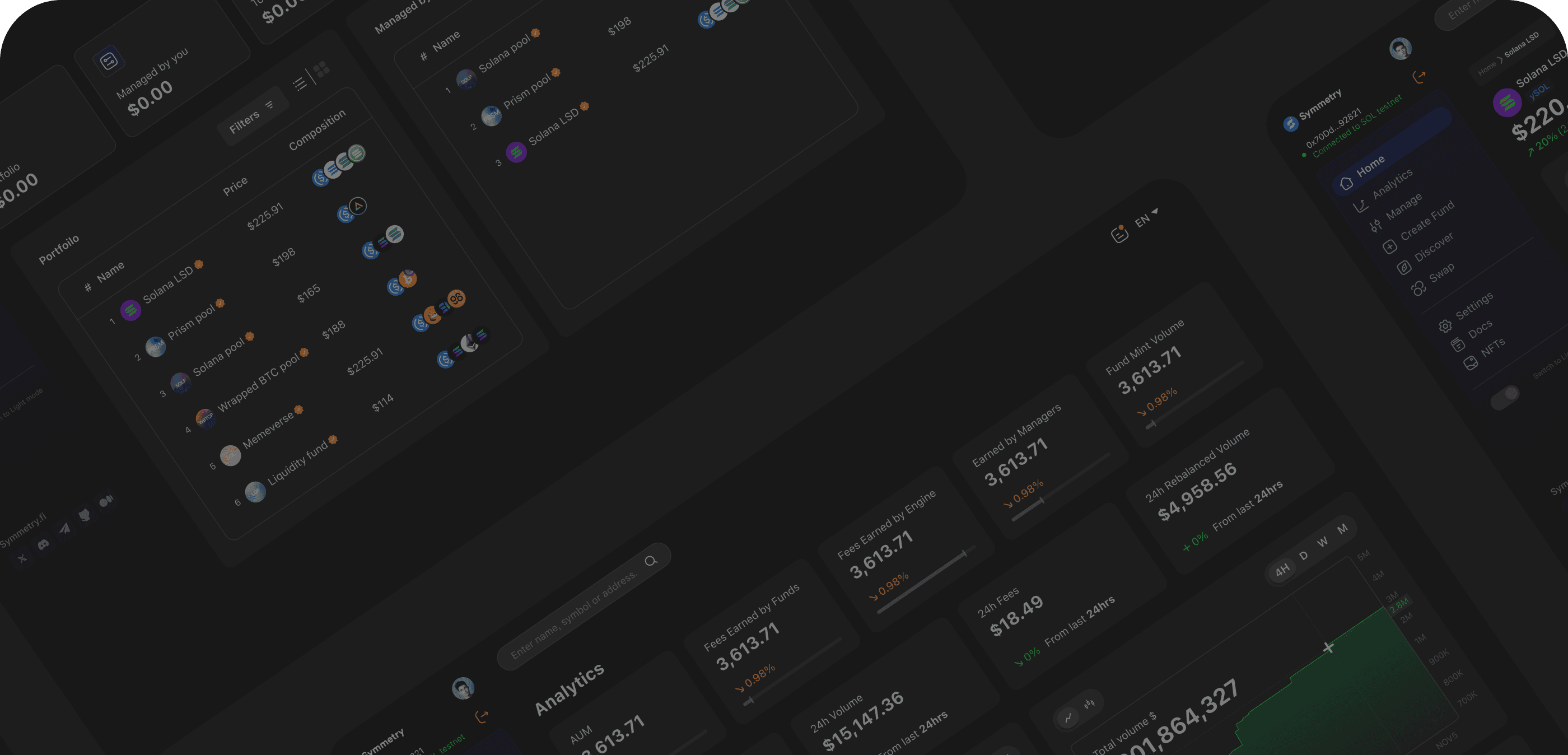
This consists of 4 UI screens
which include the dark mode screens
and other sub-screens.
The
Rationale
Home Page
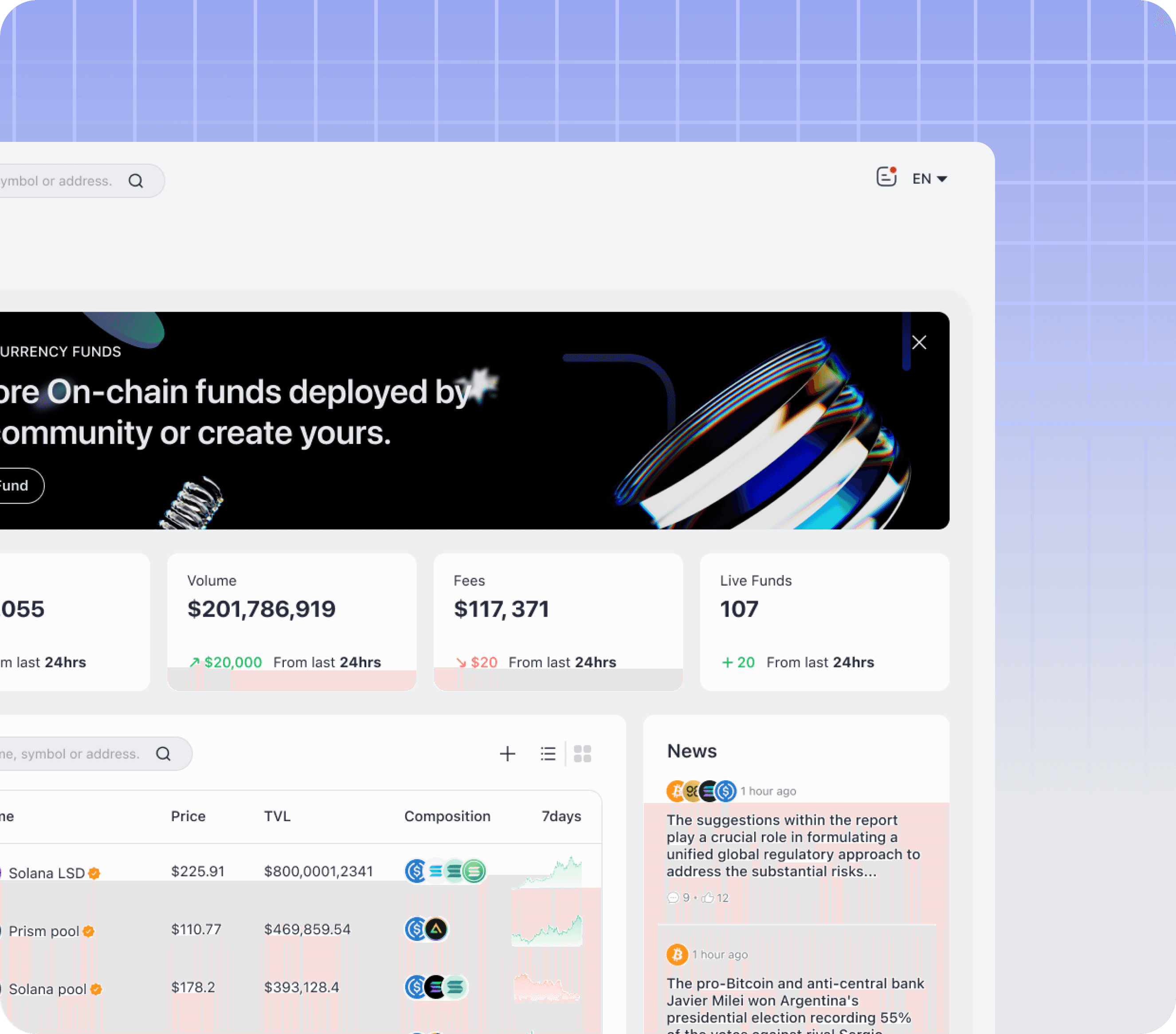
Located at the top of the homepage, the banner is the first visual element that users encounter. Its prominent position ensures that it commands immediate attention, effectively guiding the user's gaze and introducing them to the essence of the web app.
The banner utilizes captivating imagery and a touch of storytelling with a CTA to engage users emotionally and pique their curiosity. This visual narrative entices users to explore further and delve into other features.
Analytics
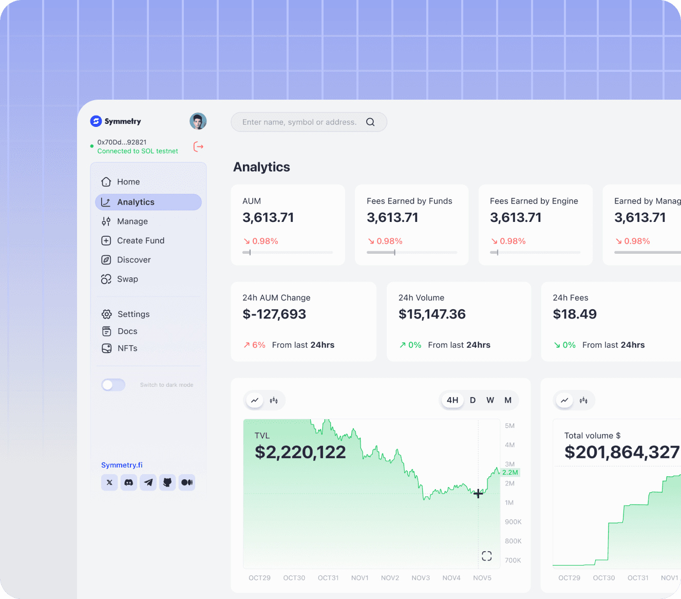
The Analytics Page offers a comprehensive dashboard, strategically designed to provide you with a visually rich and informative overview of historical charts, total volume, and overall funds activity. As you land on this page, your attention is immediately drawn to a well-organized display of key statistics and metrics, offering a snapshot of essential information at a glance.
Real-time updates on important data, such as the current price and the percentage change over the last 24 hours, are displayed at the top of the page. This instant access to crucial information lays the groundwork for you to make well-informed financial decisions.
Manage
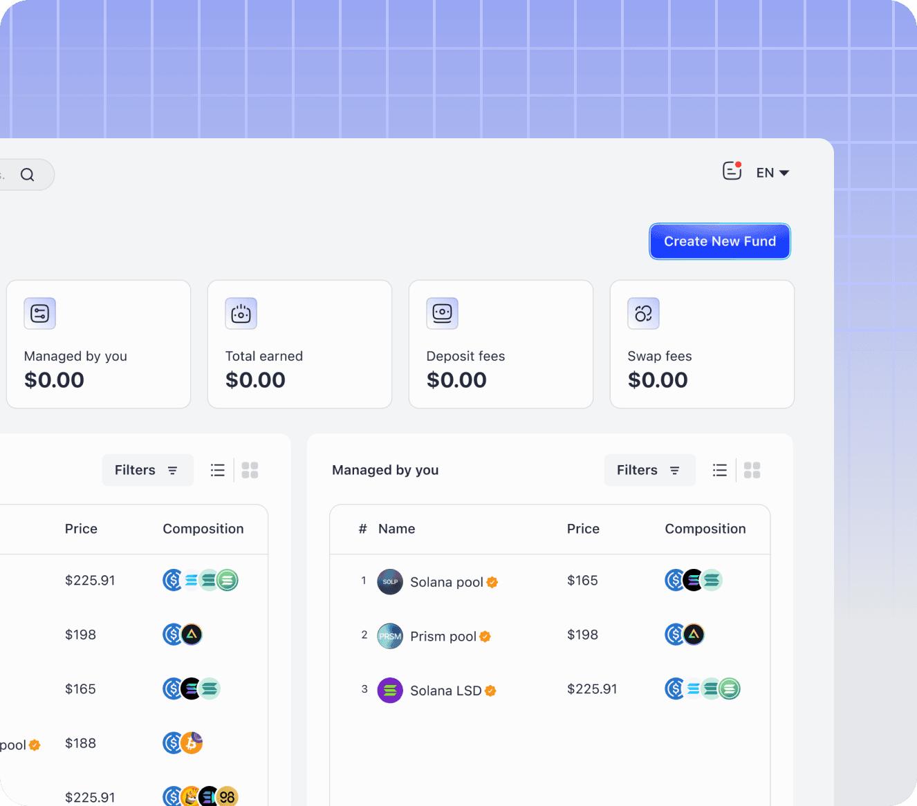
The Manage Page embraces a minimalist design, offering you clarity and simplicity to enhance your user experience. Upon entering the page, you are greeted by a clean and intuitive dashboard that provides you with a comprehensive overview of your on-chain activities.
The careful design of this page aims to improve your DeFi experience. Its user-friendly interface prioritizes simplicity, making it a helpful tool for anyone looking to confidently manage their funds.
Create a Fund
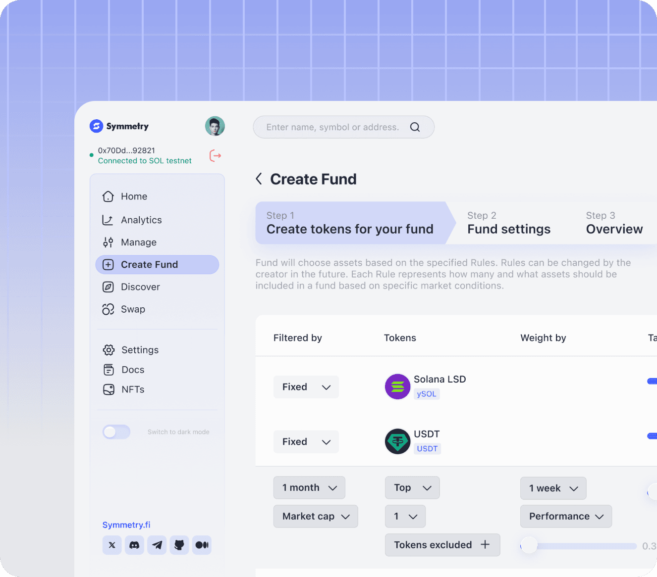
The Create a Fund page employs an intuitive design that utilizes clear icons and concise descriptions to represent the three key steps involved in fund creation. This visual representation enhances clarity and guides you effortlessly through the creation process.
The interface embodies the essence of simplicity and efficiency, allowing you to effortlessly create and manage your own funds, regardless of your technical expertise.
You can either directly select the fund's composition assets and define your respective weights or opt for implementing 'rules' for automated fund management.
Key
Takeaways
We aim to create an environment that not only facilitate automated asset management but also nurtures a sense of trust and community among Symmetry users.
Thank you
we hope you loved it
The Symmetry
Engine
The Symmetry
Engine
Redesign
Redesign
Symmetry offers a decentralized Crypto Indices and Actively Managed Funds infrastructure layer on Solana - through on chain programs and SDKs called Symmetry Engine.
Symmetry offers a decentralized Crypto Indices and Actively Managed Funds infrastructure layer on Solana - through on chain programs and SDKs called Symmetry Engine.
Please View On Desktop
Please View On Desktop